
Team
Product Manager, Scrum Master, Development Team, and QA Team
Type
Design System
Role
Research, Style Guide, Pattern Library, Design Documentation, and Design Hand Off
Duration
3 Months (Dec 2021 – Current)
Overview
Falcon is Staples’s in-store shipping application. Retail associates use it to estimate shipping rates, print shipping labels, etc.
As part of the code rewrite project, Staples wanted to give Falcon an up-to-date look. My task for this migration was to improve the UI and build a design system to reduce design debt.

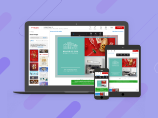
Falcon’s Old UI

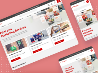
After the UI Update
Identifying Pain Points
I wanted to investigate the existing problems so that the project is not an aesthetic update. I reached out to the stakeholders and designers and identified two pain points.
01. No UI Update or Cleanup
Falcon is a platform for the associates, so functionality was always the priority.
Therefore, there wasn’t much investment in the UI. The UI was from a template we purchased years ago, and there has not been a push for updates or cleanups. This made the interface look outdated and packed with unused features.
02. Absence of Design Library
There wasn’t a collection of reusable assets and components to build screens. As a result, creating a hifi mockup became a long process and often made inconsistent assets, which led to user confusion.
As Falcon grew more extensive with more features, this became a considerable design debt.
Setting Goals
I refined the project goals based on the findings as the following:
– Creating cleaner and consistent UI elements
– Building a design library with reusable components and rules of their use
– Creating all screens in Sketch
Design Process
Learning
Visual Language & Style Guide
Pattern Library
Documentation
Hifi Mockup
Preparation & Learning
I started by researching the critical steps of building a design Library, and this was where InVision and UX Pin‘s articles proved helpful. They suggest running a visual audit to understand how much of an undertaking this process might be. I also looked at the Design systems of Big brands to understand their structure.
Visual Audit
I took a list of all UI components and inspected values such as colours, font sizes, text style etc. This process revealed many inconsistencies with the current interface. For instance, Falcon used blue as a Primary colour and had 20+ shades across the site.

Collecting Reference
I looked at Design Systems from Goldman Sachs, Google Material Design and others, noting how they structured their documentation. I also downloaded their Pattern Libraries in Sketch, which I used as a reference/inspiration when I built a Falcon’s Pattern library.

Visual Language and Styleguide
Falcon’s pages are heavy with form fields and data tables. To ensure the design facilitates efficiency, I focused on improving the current visual properties. For example, using consistent spacing rules, creating hierarchy and clarity with typography, improving colour contrast ratio and more.
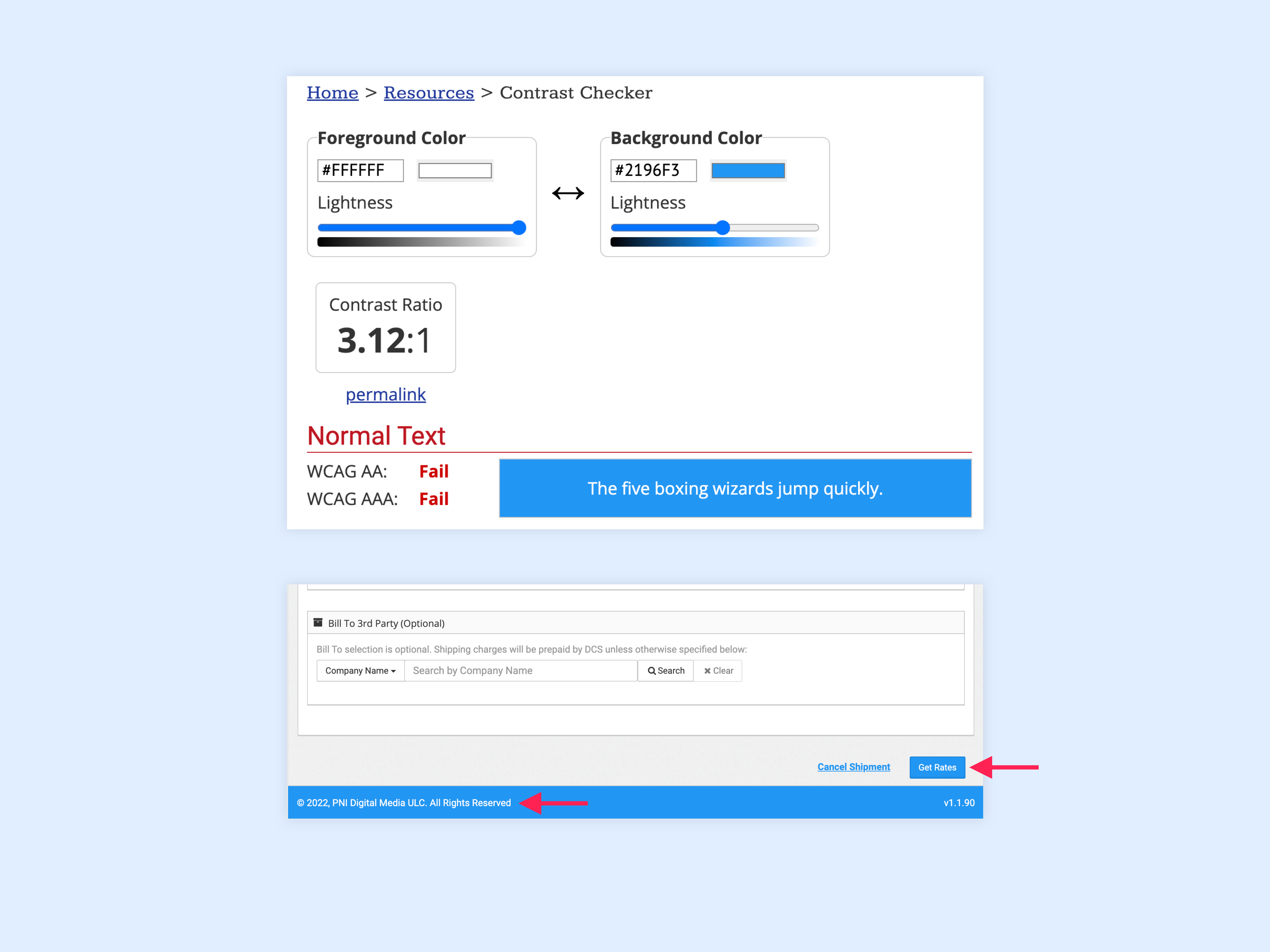
Example – Colour Update
Falcon’s Primary colours are blue and white. However, when used together, they had a low colour contrast ratio, so I adjusted the colours with a web contrast checker. The new blue is more saturated and darker, and when used with the same white, the colour contrast ratio is much higher, thus passing the WCAG Level AAA contrast requirement.

Other visual properties, such as typography, space and imagery, were defined similarly. I increased the font sizes to increase readability and used 8px units to determine the vertical and horizontal spacing.
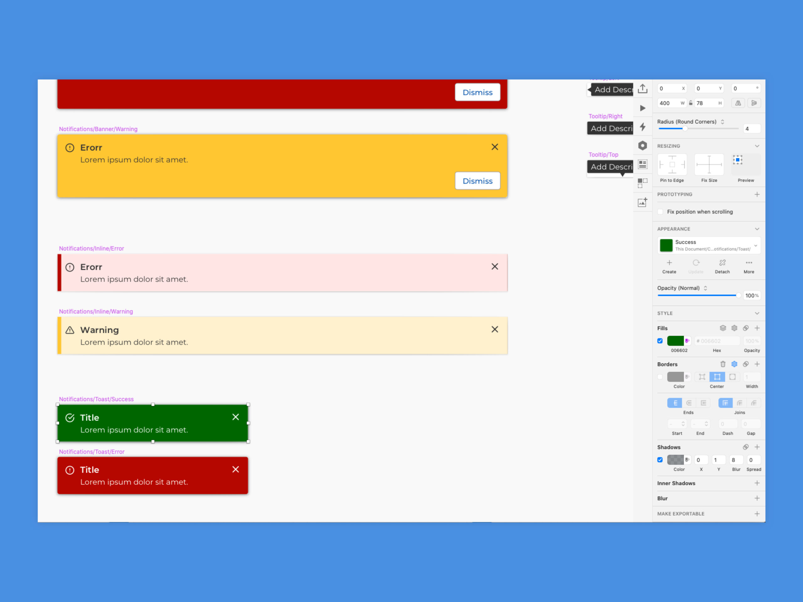
Pattern Library
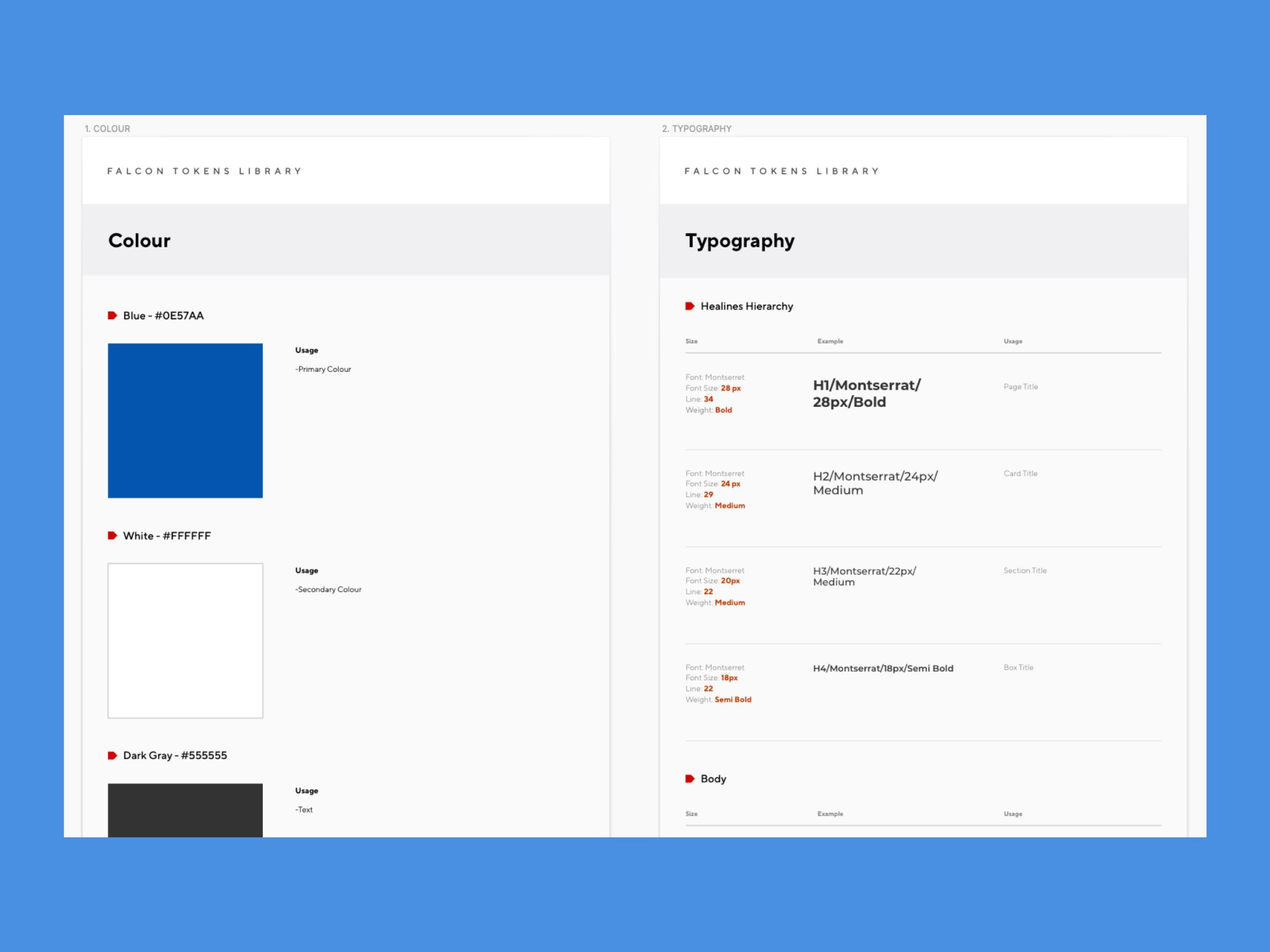
With the main ingredients ready, it was time to build the components.At PNI, we use Atomic Design to create a Pattern Library, so I followed the same structure for Falcon and made UX improvements along the way.
Building Design Blocks
First, I started with the smallest design blocks, such as colours, fonts, etc. Then, I defined each component and its interactive states, using Layer and Text styles and created everything as a symbol.
During this process, I continued communicating with the Falcon team, merging duplicated assets and removing items when users did not use them.
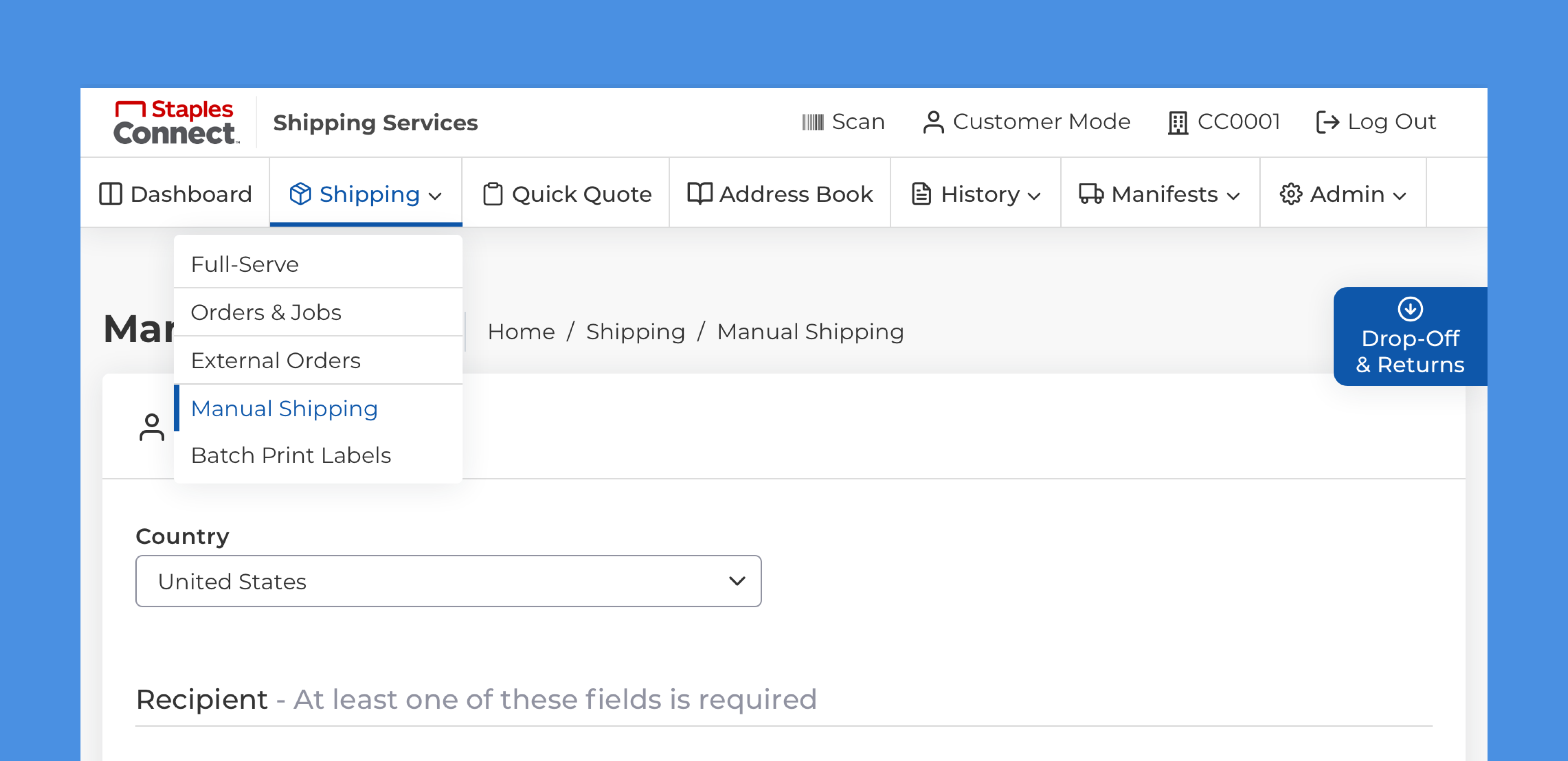
UX Improvement Example – Navigation
I made some UX improvements along with the UI improvement. The main navigation is a good example.
The original navigation had ten top-level options, making it difficult for users to process the information. Therefore, I limited the number to seven, prioritizing and grouping them into categories by doing a card-sorting exercise.

Original Navigation
 Updated Navigation
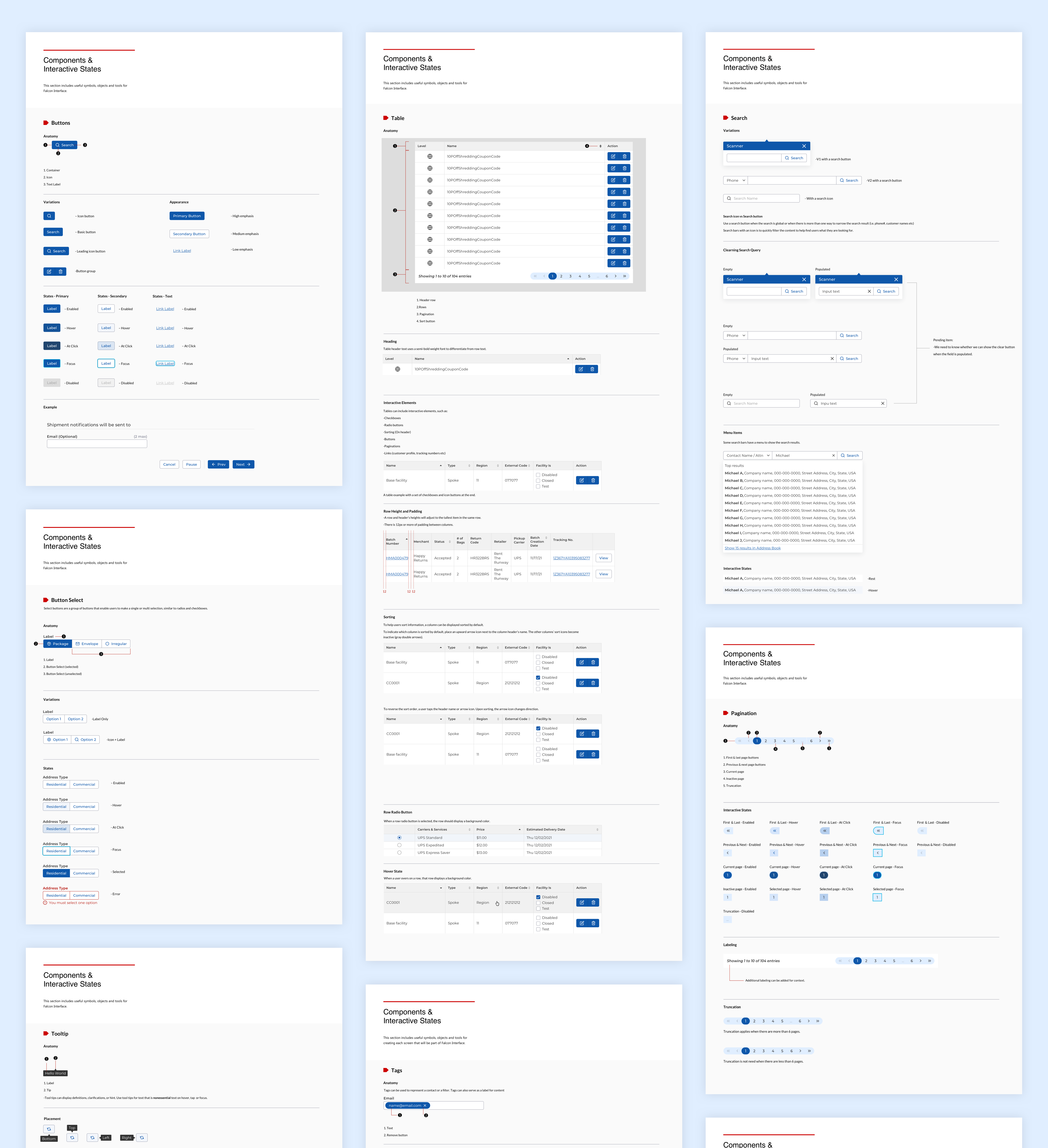
Documentation & Standards
After creating all the components, it was time to document how and when to use them. I’ve included the component’s title, description, interactive states, and example in each Documentation.
Complete Documentation is available here.
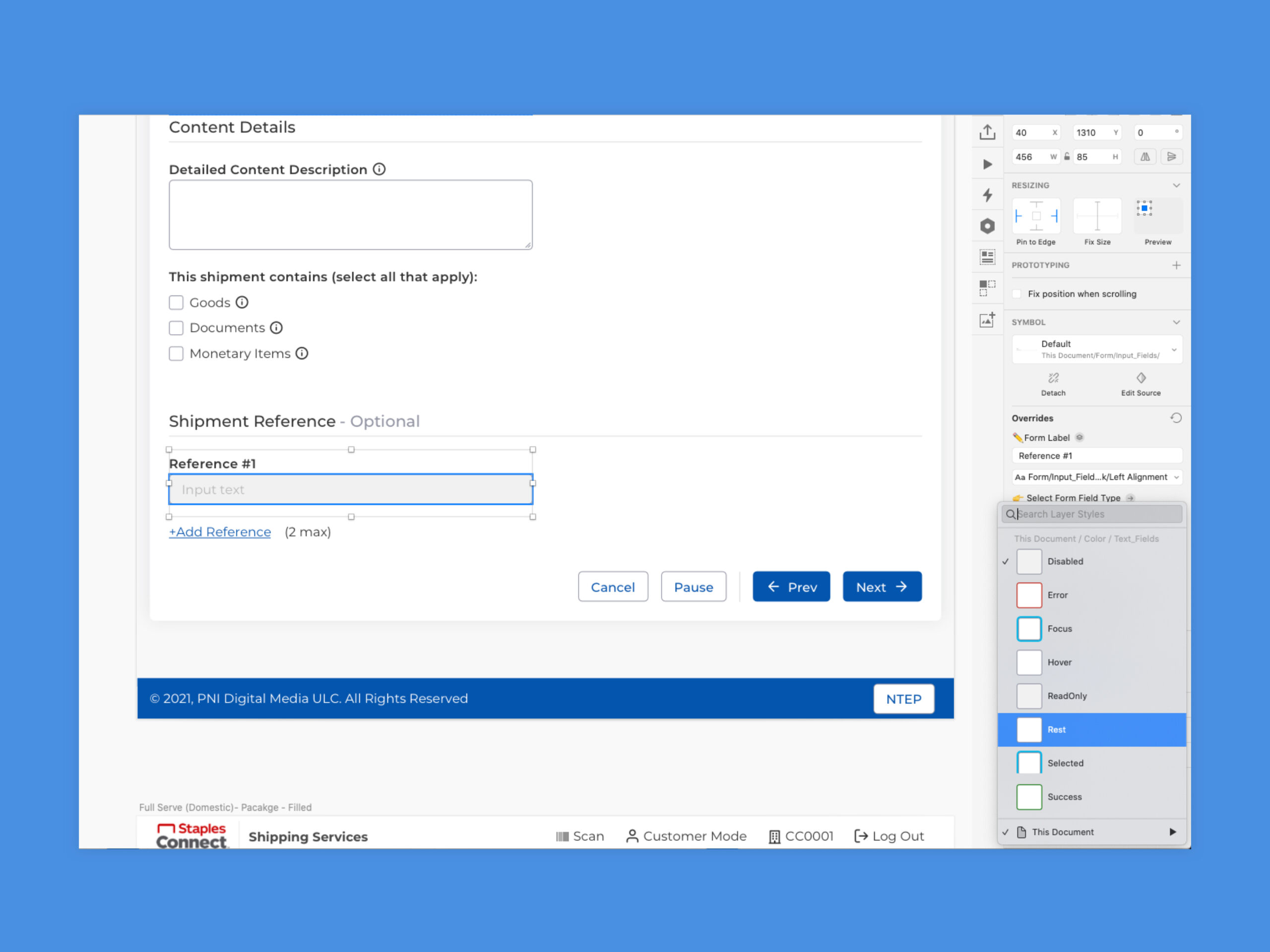
Screens
Using the design system, I put together hi-fi mockups one by one. We started with the most important pages and defined what to create on each sprint.
Building the Style guide, Pattern Library, Documentation, and Hifi Mockups was not a one-go process. I had to go back to some elements to identify the best architecture for all pages.
Reflection
As a new member of the Falcon Team, I was glad this was my first project. I now understand how each component should behave and the purpose of every page.
This was the first extensive Design System that I built from the ground up. I hope this is used to promote consistent design language for future Falcon projects.