
Team
Project Manager, Scrum Master, and Developemnt Team
Type
Responsive Web Builder Tool
Role
Research, UX UI Design, Prototyping, and Design Hand Off
Duration
3 Months (April 2021 – June 2021)
Project Overview & Problem
Staples wanted to make it easy for customers to create professional-looking photo products on their Custom Print site. However, it is not always easy for customers to find the perfect images for their projects.
To accomplish this, Staples partnered with Shutterstock and reached out to us to integrate a Stock Image Tool, allowing customers to create photo products with high-quality images right on their site without finding them elsewhere.
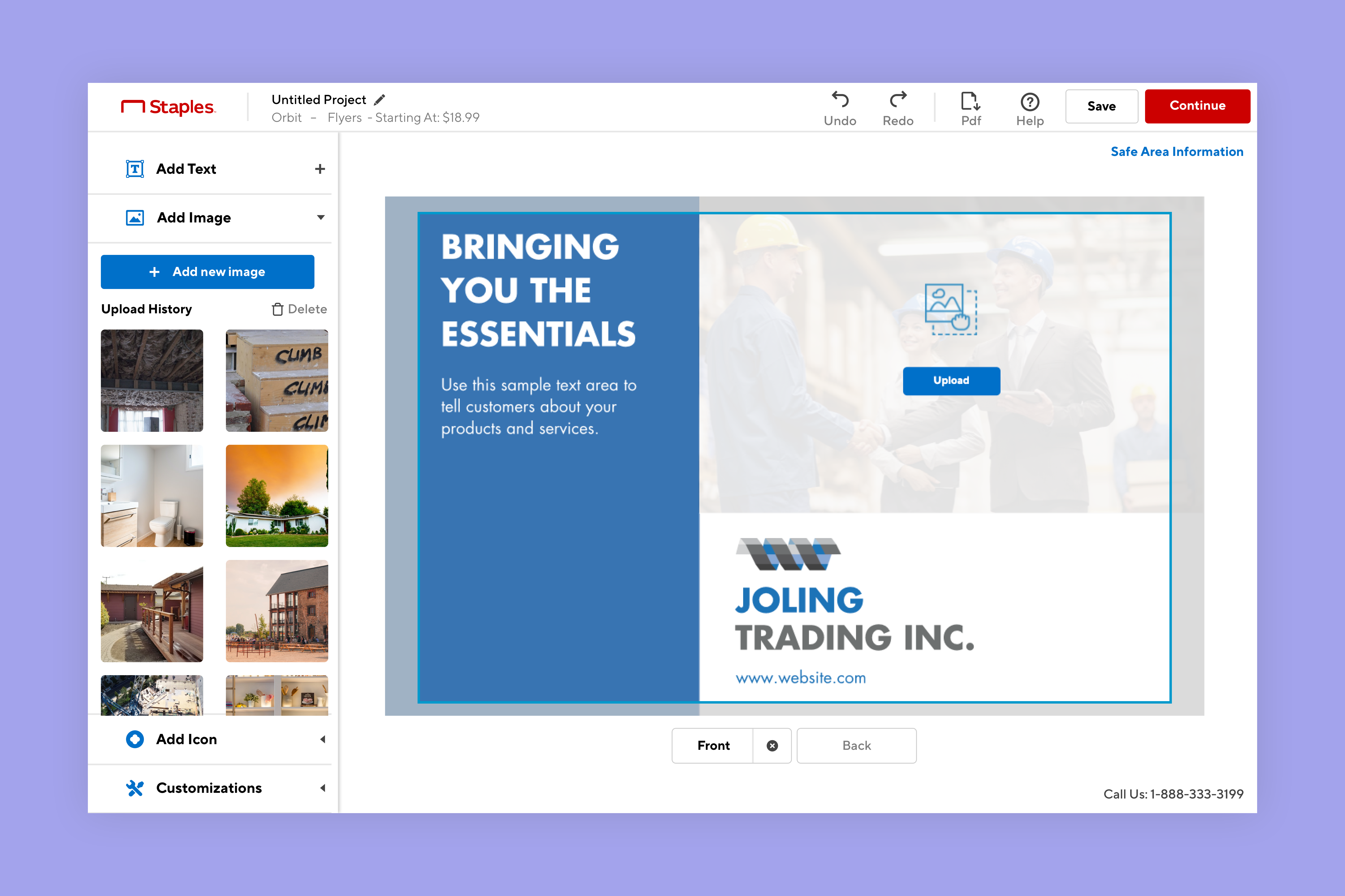
Original Apollo Builder

Apollo Builder with new Stock Image Tool & Menu
Design Process
Learn
Ideate
Design
Hand off
Research & Discoverability
I started by studying Apollo & Shutterstock, learning what interactions and tools existed and the pain points. I then went to sites with similar experiences and gathered insights and ideas.
Lastly, I identified the areas on the site that needed to be updated to add this new Stock Image experience.
Studying Apollo & Shutterstock
First, it was time to become familiar with Apollo Builder and Shutterstock’s API tools and understand how they currently work. This was crucial as I needed to know how all the tools work together and interact.
By reaching out to the PM & designers who’ve run usability tests on the Builder, I identified the following pain points with Apollo:
- The Accordion menu has minimal space to show content.
- The only way to add an image is Drag & Drop, which is not an accessible interaction.
Competitive Analysis
At the same time, I wanted to understand how the competitors’ builders provide similar offerings. So I visited Canva, Adobe Spark and Vistaprint to collect references and ideas.

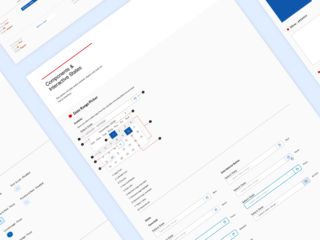
Understanding How the New Feature Impact the Site
I created a diagram to identify where updates were needed to the site to integrate this new service. I worked with my manager and to divided the work with another designer. My portion of this project was primarily on Apollo, building an experience for customers to find and add Stock images to their designs.

Ideation
At this stage, I brainstormed ideas and prioritized solutions with the stakeholders. Also, I’ve reached out to the development team to understand technical limitations.
Workshop
I’ve invited key stakeholders to a workshop to generate ideas together. We started by writing board ideas, then narrowed our focus.
We used a simple effort/impact scale to determine what solutions/features make the most user impact within what we can realistically be achieved. This process helped us decide what to work on first and assisted in any backlog.

Understanding Constraints
Aside from this workshop, I ran a small exercise with the dev team to understand the design and technical constraints. For example, I learned that Apollo could not support infinite scrolling to load more images. Knowing this information helped me reduce the redundances in the process.

Sketch / lo-fi wireframes
Refining and visualizing the solution
I drew rough sketches using all the knowledge and insights from the previous phases; eventually, consolidated them into Sketch and created a lo-fi wireframe.
I had several review sessions with the team to select ideas and created a prototype using InVision.


Iterations
Updating design based on feedback
I updated the wireframes using the insights and feedback from the Design Team/Stakeholders.
There were two main improvements needed:
0.1 Menu
In Apollo, every tool lives in the left accordion menu, and the early iteration of the Stock image tool was one of them. Unfortunately, the accordion only allowed a tiny space to show the content inside of each menu item. A content-heavy tool like the Stock image tool was not a good candidate for this. Yet, changing the menu’s layout was out of scope and would require considerable development effort.
After discussing this issue with the PM, the Dev lead and the leadership team, it was decided to take a big step to update the menu’s layout to a Sequential menu. This way, the selected tool can utilize the whole vertical space, and it solves the real estate issue of other content-heavy tools in the builder.
Before: Accordion menu
After: Sequential menu
0.2 Image Price
The other feedback I received was about the price information. I used a price badge on top of every image to indicate everything was the same price in my initial version.
However, many people thought that photos would have different pricing because there was a badge on every image. Therefore, the badge was removed, and a card was placed to indicate that the price for all images is the same. I positioned it at the top to ensure the price is visible to users before they start browsing.
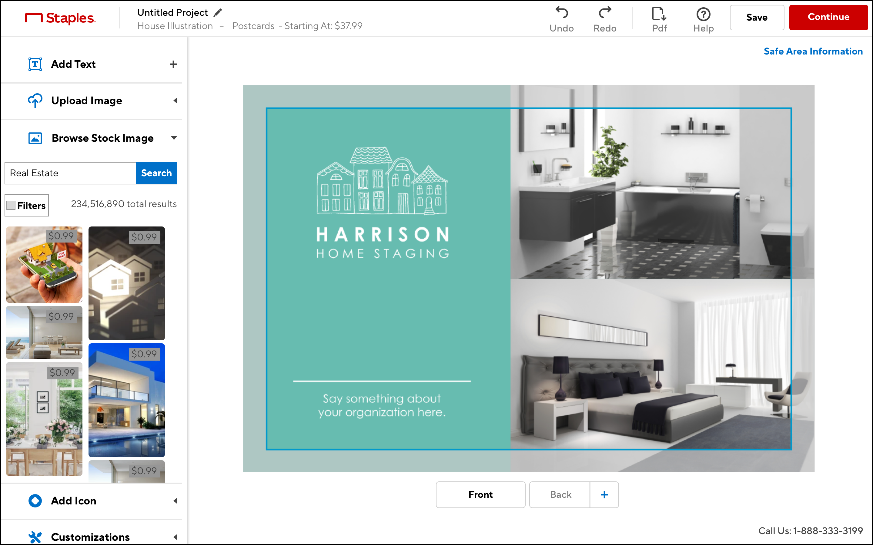
Before: Price Information on images

After: Price Information on a card
Hi-fi mockup
Bring it to Life
Using the wireframes as a blueprint, I created desktop, tablet and mobile hi-fi mockups using Sketch and Invision.
Stock Image Screens
Includes the Image library, Notification, Information Lightbox, Filters, Tool Tip etc.


Optimizing the Builder Menu
Updated the other tools in the builder into a sequential menu. This solved the existing real estate issue.

Design for accessibility in mind.
16px+ font size, AA colour contrast ratio and Single point gesture

Applying 8px Spacing Rules
Using multiple of 8 to define the spacing to achieve consistency across the platform.

The interactive States and UX note
Documenting details for hand-off
The hi-fi mockup is a great way to document the screens in breakpoints, however, it does not necessarily explain how every interactive element would look when clicked, pressed, etc. It is much easier to communicate this to the development team in separate documentation.

I also used InVision’s comment tool to add any explanatory comments. Not every interaction needs to be flushed out with mockups. Instead, I used the comment tool to explain the interactive pattern that exists elsewhere or was unnecessary to draw out.

Reflection
Result
- The Shutterstock experience produced $15.4K in sales within the first three months of launch.
- Builder UI, improving builder success rate by 3%, driving incremental growth at+1.4M annually.
Final Thought
This project was unique because of its scope. It had gotten more extensive in the middle to resolve another known issue with the builder. As a result, there were more screens to produce, and we needed to change our project estimates. However, I am thrilled that this new feature and menu will improve the overall experience.
In addition, I learned how to pivot an idea when needed and phase tasks out so that the design and development can work simultaneously.