
Team
Product Manager, Scrum Master, Development Team, Marketing Team, Graphic Design Team
Type
Page Redesign (UX/UI)
Role
Research,Wireframe,Hifi Mockup, and Design Hand Off
Duration
3 Months (April 2020 – June 2020)
Overview
Staples Business Printing site struggled with low user engagement and as such, a redesign was requested. The goal was to make the Homepage more accessible to users by allowing them to find what they need to start their printing projects more easily.
I was in charge of research, wireframing, prototyping, and hand-off for this project with another product designer.

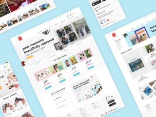
Original Homepage

Updated Homepage
Design Process
Research
Ideate
Design
Hand Off
Planning
The business wanted to build user engagement on the Homepage. To achieve this, my priority was to understand the users and their needs, rather than only considering the business perspective.
I asked myself several questions and defined the research methodology accordingly:
1) How are users currently using the Homepage?
How long do they use it?
👉 Collecting data from Google Analytics
👉 Watching user session recording
2) What is our current home page like, and what is missing?
👉 Reading best practice articles
👉 Stakeholder Interview
👉 Accessibility audit
Research
Following the initial data collection, further analysis was done to assist in identifying the main points and areas of improvement. The following are the key findings:
Insight #1
- Many customers thought they were on the Parent site Staples.com
- Customers did not know the value of ordering from this site over competitors

Insight #2
- Showing Popular Products made users think they were the only products carried
- Customers go to Homepages to look for deals

Insight #3
- There is no logical keyboard order set up for the Homepage
- The moving carousel is not accessible

Goal
Based on the findings, the following goals were set:
1) Communicate the site intent, benefits, and differentiators
2) Build awareness of the products
3) Create an accessible content-rich page (meeting WCAG’s AA guidelines)
Wireframe
Using the knowledge and insights from the research stage, rough sketches were produced. Lo-fi wireframes were then created in Sketch. After several sessions with my teammate and the Product Design lead, ideas were refined and chosen.

Sketch

Wireframe Top

Wireframe Bottom
Iterations
Several updates were made to the wireframes using the insights and feedback.
There were two main improvements needed:
Promotion Tiles
Some deal-seeking customers explore the Homepage to look for promotions. To take these users into account, I initially placed the promo blocks horizontally, taking ample space in the prime content location of the page. However, this format made them look like Ads, which customers would ignore, and made the prime area look visually clustered.
To take a less aggressive approach, I minimized the size of the promo tiles, still ensuring they were available at the visual viewport. This made the hero banner and the value propositions more of a visual focus.

Before: Stacked Promo Tiles

After: Minimized Promo Tiles
Carousel Controls
The original carousel control arrows were more opaque, and the colour contrast between the arrow and the background was not high enough. This made it difficult to tell where or if there were controls.
To fix this, we placed the arrows on top of a container and used a dark gray colour for better colour contrast.

Before: Control Arrows Invisible Due to Styling

After: Control Arrows with New Styling
Keyboard Order & Challenge
To make the keyboard navigation logical and intuitive, we followed the page’s visual flow (left to right and top to bottom). Defining the order was straightforward on the Homepage until we encountered the carousel.
Making an accessible carousel requires extra attention as it can be cumbersome for keyboard users if the order is not defined correctly. In addition, enabling the arrow button to receive the focus order would be awkward for keyboard users. Imagine tabbing on the next arrow to see the next set of panels and back-tab off the next arrow onto the panel they are interested in, this would create confusion. For this reason, we allowed the focus to skip the arrow buttons, and allowed the focus to go to the next panel automatically.

Enabling arrow buttons vs Disabling arrow buttons
High fidelity Design
I designed desktop, tablet, and mobile pages using Sketch & InVision.

Hero Banner & Promotion tile
- Static hero banner that communicates who we are, what we do and what values we can bring to our customers.
- Three tiles to introduce ongoing promotions, seasonal offers and new products.

Value Props
- Simple statements that highlight how our services and products make us different from competitors and unique

Shop by Products
- Top-selling product displays are shown here. We choose to use badges to indicate what is provided.

Category Overview
- Displaying the primary navigation categories to communicate the various products the site offers.

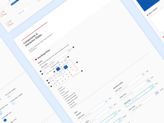
Design Hand Off
We’ve produced a design package for the development, marketing, and Graphic Design teams, including character count limits, image specs, and tab navigation documentation.

Defining character limit for the content copy

Asset Spec for Graphic Design Team